19 June 2022
Atmospheric Perspective
Alongside linear perspective, there is atmospheric perspective. In this post, I explain what it means and how you can use it to create an illusion of depth in your paintings.
What Is Atmospheric Perspective?
Atmospheric perspective describes how the atmosphere affects the appearance of objects as they recede into the distance. Their clarity, tonal contrast and colour saturation diminish, and distant objects often appear cooler in colour.
Atmospheric and Linear Perspective
There are two types of perspective: atmospheric and linear. Atmospheric perspective concerns the effect of the atmosphere on what we see. Linear perspective concerns the relative size of objects and how they appear smaller as they recede.
Understanding both is essential to painting accurately, although we often think only of linear perspective when discussing perspective.
Leonardo da Vinci understood the importance of atmospheric perspective. His extensive writings suggest that he considered it as important in painting as linear perspective. Many of his paintings have an almost ethereal quality, created through its skilful use.
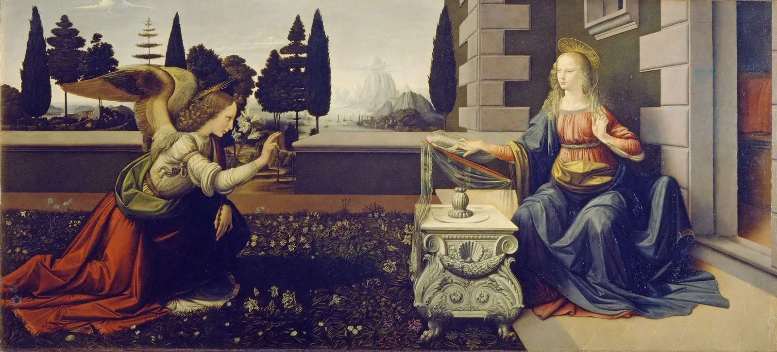
Atmospheric Perspective and Realism
Both types of perspective help us create realistic paintings because they reflect how we see. Linear perspective is easier to demonstrate when architectural elements are present, as in the John Singer Sargent painting below. In landscapes and seascapes, where buildings may be absent, atmospheric perspective becomes especially useful for creating depth.
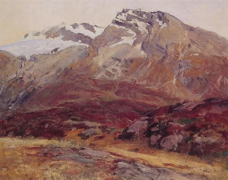
Four Keys to Creating Atmospheric Perspective
- Texture Texture can refer to two things:
- The physical texture of the paint; or
- The illusion of texture, such as using scumbling to suggest dry bark on a tree.
To create depth, contrast a textured foreground with a smoother background. This reflects how we see detail: nearby stones, blades of grass, branches, insects and plants are clearly visible. Suggest these through a physical build-up of paint or more varied brushwork and colour in the foreground.
Looking further into the distance, those small details and textures disappear into broader masses of colour and shape.
2. Value: Value describes how light or dark something is on a scale from black to white, with black the lowest value and white the highest.
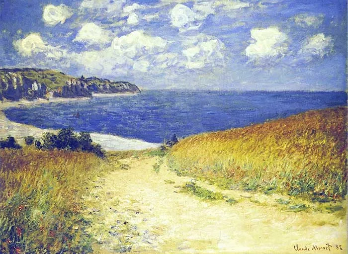
As an object recedes, it often appears lighter than it really is. Distant objects tend to look greyer and several values lighter.
In the Claude Monet painting below, notice how the distant cliffs on the left are lighter and greyer than those closer to us. The sky just above the horizon is also lighter and greyer than the sky above. These effects push areas back and create depth.
- Clarity This is a simple idea, yet beginners sometimes struggle with it. An object seen from a distance appears to have less colour and detail than the same object viewed close up.
When painting distant mountains, you do not need to include every rock, shadow, tree or other detail. Simplify them.
You may sometimes simplify the background even further to emphasise the sense of depth.
In the Turner painting below, compare the clarity of the foreground with the background. The background contains almost no detail and primarily creates atmosphere. The most detailed area is the nearest part on the right.
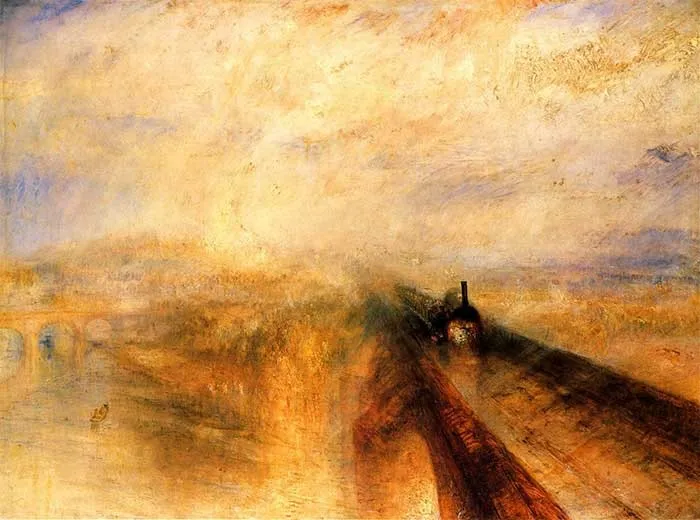
- Colour Temperature and Saturation As an object recedes, its colour often shifts towards cooler blues, purples and greens. Colours also appear less saturated and intense.
You can still use warm colours in the distance, but they will generally look cooler than nearby equivalents. A bright orange object, for example, appears distinctly orange close up. Further away, it may seem cooler and less saturated, as though a little blue or purple had been mixed into the colour.
Summary I hope this post helps you understand atmospheric perspective and use it to create depth, particularly in landscapes and seascapes where linear perspective is less obvious. Share your own tips in the comments below.
Bedankt voor het lezen! Voel je vrij om te delen met vrienden. Als je meer schildertips wilt, bekijk dan mijn basiscursus.
Happy painting!